
Form Components
A Form component collects user data and serves as the display or user interface. Form components define the type of widget that users will enter their data and will automatically add a property to interact with the Form component.
Adding a Form Component
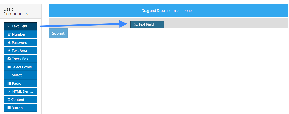
To add a form component to a form, drag and drop the component from the left column into the desired location within the form.
Each new form starts with a submit button automatically added to it. This can be removed or edited as necessary.
Editing a Form Component
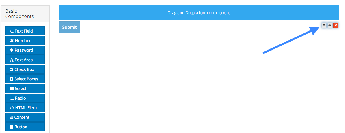
To edit a form component on a form, hover over the component and click the gear icon. You will then be presented with a settings form for the component.
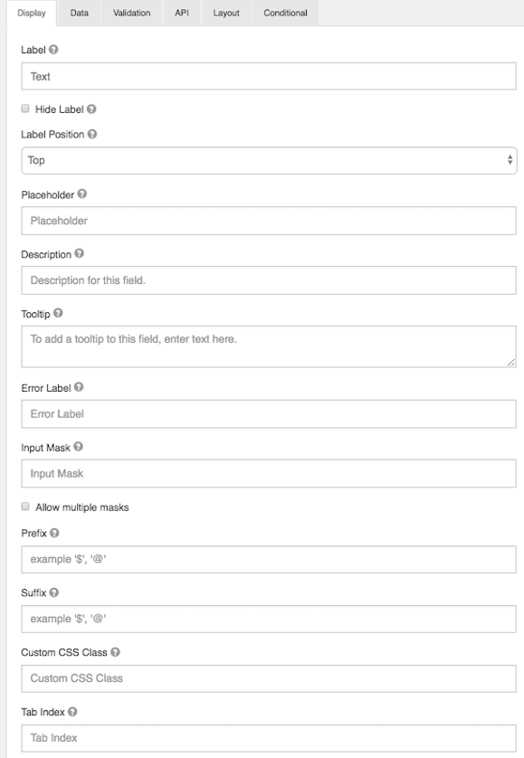
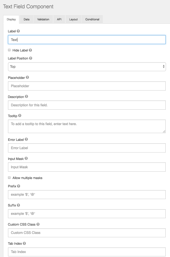
Note: The settings for a form component are different for each component type.
General Settings
Below is a list of general settings that are offered for the majority of our components.
Label
The name or title for this component.
Hide Label
Hide the label of this component. This setting will display the label in the form builder, but hide the label when the form is rendered.
Label Position
Position for the label for this field.
Label Width
The width of label on line in percentages.
Label Margin
The width of label margin on line in percentages.
Placeholder
The placeholder text that will appear when this field is empty.
Description
The Description is text that will appear below the input field.
Tooltip
Adds a tooltip icon to the side of this field.
Error Label
The label that will display for the field when a validation error message is shown.
Input Mask
An input mask helps the user with input by ensuring a predefined format. For a phone number field, the input mask defaults to (999) 999-9999.
- 9: numeric
- a: alphabetical
- *: alphanumeric
Allow Multiple masks
This setting will allow you to set multiple input masks for the field. The mask is selected by the user via a dropdown list and will dynamically switch the mask for the field when selected. This feature is only availabe on our formio.js renderer.
Prefix
The text to show before a field. An example is ‘$’ for money
Suffix
The text to show after a field. An example would be ‘lbs’ for weight.
Custom CSS Class
A custom CSS class to add to this component. You may add multiple class names separated by a space.
Tab Index
Sets the tabindex attribute of this component to override the tab order of the form. See the MDN documentation on tabindex for more information on how it works.
Multiple Values
If checked, multiple values can be added in this field. The values will appear as an array in the API and an “Add Another” button will be visible on the field allowing the creation of additional fields for this component.
Enable Spell Check
This setting will enable spell check on the field.
Protected
If checked, this field is for input only. When being queried by the API it will not appear in the properties. You can still see the value on the record by viewing the form submissions.
Persistent
If checked, the field will be stored in the database. If you want a field to not save, uncheck this box. This is useful for fields like password validation that shouldn’t save.
Encrypted
Encrypt this field on the server. This is two way encryption which is not be suitable for passwords. This setting is only available on the ‘Enterprise’ project plan.
Hidden
A hidden field is still a part of the form JSON, but is hidden when viewing the form is rendererd.
Initial Focus
Make this field the initially focused element on this form when renderered. Only one component on this form or wizard page can carry the Initial Focus setting.
Hide Input
Hide the input when viewing the form from the front end browser. This does not encrypt on the server. Do not use for passwords.
Disabled
Disable this field on the form.
Show Label in DataGrid
Show the label of this component when in a datagrid.
Table View
If checked, this value will show up in the table view of the submissions list.
Textfield
A textfield can be used for short and general text input. There are options to define input masks and validations, allowing users to mold information into desired formats.
Number
Number fields should be used whenever a field should be limited to a type of number value.
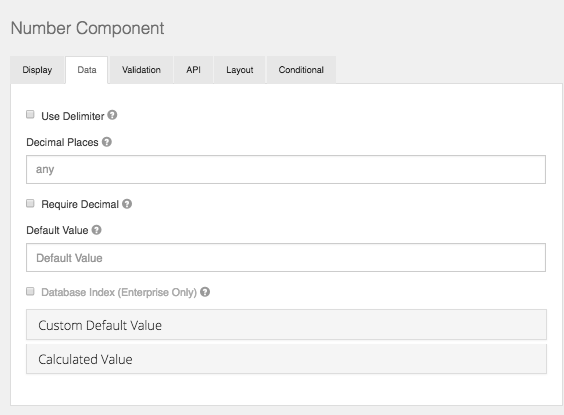
Use Delimeter
Check this setting if you would like the value in this component to separate thousands by local delimiter
Decimal Places
The maximum number of decimal places for the values in this field.
Require Decimals
Always show decimals for this field, even if trailing zeros.
Password
The password field has the same options as a text field component. It differs from a text field in that its html <input> type will be password instead of text. This will cause the field to display asterisks instead of the value entered.
Text Area
A Text Area has the same options as the textfield form component. The difference is that it will be a multi-line input field that allows for longer text. The Text Area can also be utilized as a CK Editor WYSIWYG for the end user which is configured within the component settings.
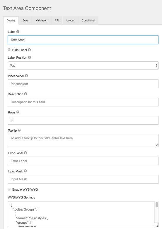
Rows
This allows control over how many rows are visible in the text area.
Enable WYSIWYG
This setting will turn the Text Area into a user interface WYSIWYG using the famous CK Editor.
WYSIWYG Settings
Here you can modify the code base of the wysiwyg to customize the UI specific to your needs.
Check Box
A check box is a boolean value input field. It will either be on or off.
Label
The label for this field that will appear next to it.
Custom CSS Class
A custom CSS class to add to this component. You may add multiple class names separated by a space.
Tab Index
Sets the tabindex attribute of this component to override the tab order of the form. See the MDN documentation on tabindex for more information on how it works.
Protected
If checked, this field is for input only. When being queried by the API it will not appear in the properties and also should not appear in exported data. You won’t be able to see the value on record list but it will be stored in database under the hood.
Persistent
If checked, the field will be stored in the database. If you want a field to not save, uncheck this box. This is useful for fields like password validation that shouldn’t save.
Table View
If checked, this value will show up in the table view of the submissions list.
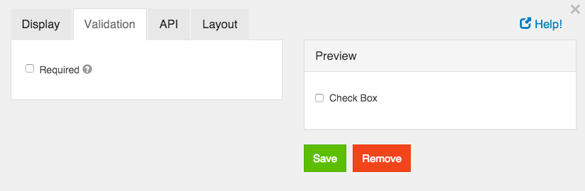
Required
If checked, the field will be required to be checked. If it is required, you may not need to persist the value as it can be assumed to be checked when a form was submitted or it will not submit.
Select Boxes
The Check Boxes form component works like the Radio component, but allows the user to check multiple values.
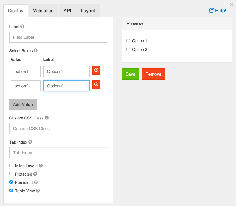
Label
The label for this field that will appear next to it.
Values
These are the values that will be selected on this field. The Value column is what will be stored in the database and the Label is what is shown to the users.
Custom CSS Class
A custom CSS class to add to this component. You may add multiple class names separated by a space.
Tab Index
Sets the tabindex attribute of this component to override the tab order of the form. See the MDN documentation on tabindex for more information on how it works.
Inline Layout
If checked, this field will layout the checkboxes horizontally instead of vertically.
Protected
If checked, this field is for input only. When being queried by the API it will not appear in the properties and also should not appear in exported data. You won’t be able to see the value on record list, but it will be stored in database under the hood.
Persistent
If checked, the field will be stored in the database. If you want a field to not save, uncheck this box. This is useful for fields like password validation that shouldn’t save.
Table View
If checked, this value will show up in the table view of the submissions list.
Required
If checked, the field will be required to have at least one box checked. If it is required, you may not need to persist the value as it can be assumed to be checked when a form was submitted or it will not submit.
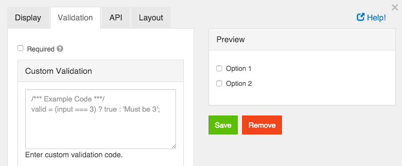
Custom Validation
You can use javascript to perform validation on a field. The way to respond is by setting the valid variable. If it is set to true then the validation passes. If you set it to a string, the validation fails and the validation message is set to whatever the valid variable is set to.
In addition, input variable is set to the value that has been entered in the field. The component variable is set to the definition of the field.
You can also reference other resources and properties for validation. For example, if there is a user resource with a password field, you can use its value with user.password
Select
A select field will display a list of values in a drop down list to users. Users can select one of the values.
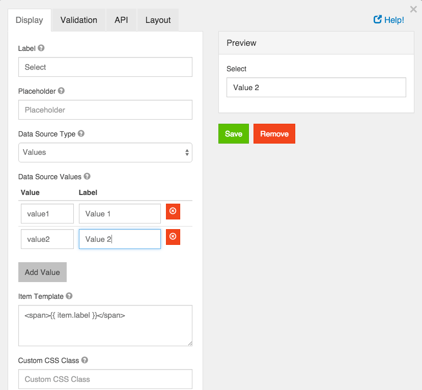
Label
The label for this field that will appear next to it.
Placeholder
The placeholder text that will appear before an option is selected.
Data Source Type
Select the type of data the options will be pulled from.
Values
These are the values that will be selected on this field. The Value column is what will be stored in the database and the Label is what is shown to the users.
Raw Json
Enter a JSON Array to use. It should be formatted as an array of objects with named properties.
URL
Enter a url with a data source in JSON Array format. This can be used to populate a Select list with external JSON values. For example, suppose you wish to populate your select drop down with a list of all States within the U.S. You can use an external JSON array like the following.
https://cdn.rawgit.com/mshafrir/2646763/raw/states_titlecase.json
And place that within the URL of the select drop down Data Source URL. You will then need to provide the Value Property as well as change the Item Template so that it will pull the right value as well as display correctly within the dropdown. The following image shows how the configuration would look for this particular setup.
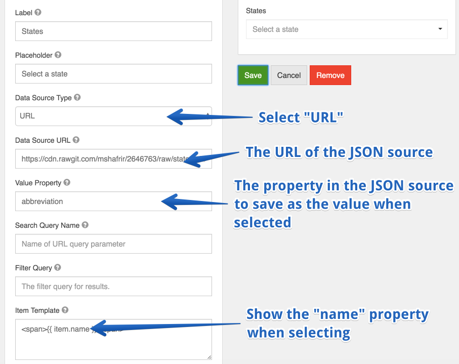
This will now turn your select dropdown into a list of available States within the US.
Value Property
If Raw JSON or URL is selected, enter the name of the property on the objects that will contain the value that will be stored in the database.
Search Query Name
If URL is selected, enter the name of the search query parameter to filter requests with. Example, if your url is http://api.dogs.com/dogs, and this option is set to type, and the user types nice in the select field, then this component will send a request to http://api.dogs.com/dogs?type=nice and update the select items with the results. If this option is omitted, no new requests will be made when user enters text in the select field.
Item Template
If Raw JSON or URL is selected, use the template field to determine how the values will be displayed in the select box. You can use the item variable to access the current object in the array. For example, you can embed the value by using {{ item.value }} in a template.
Custom CSS Class
A custom CSS class to add to this component. You may add multiple class names separated by a space.
Tab Index
Sets the tabindex attribute of this component to override the tab order of the form. See the MDN documentation on tabindex for more information on how it works.
Required
If checked, the field will be required to have a value.
Dynamic Select Filtering
A very common use case that many people have in forms is to dynamically filter a Select dropdown based on the selection of another select dropdown. The most typical usecase is a form that provides the Make, Model, and Year of automobiles where when you select the Make dropdown, it filters the Model dropdown for those that are within that Make. This functionality is covered in detail in our user guide resources section .
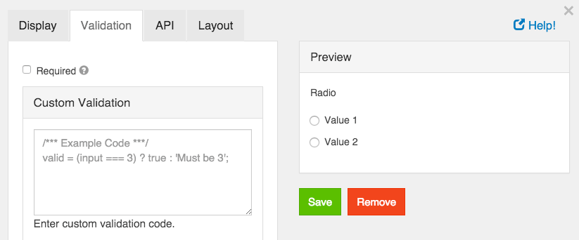
Radio
Radio form components should be used when presenting a list of options from which one should be chosen.
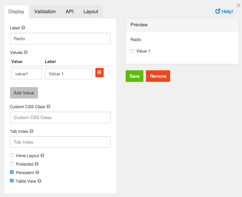
Label
The label for this field that will appear next to it.
Values
These are the values that will be selected on this field. The Value column is what will be stored in the database and the Label is what is shown to the users.
Custom CSS Class
A custom CSS class to add to this component. You may add multiple class names separated by a space.
Tab Index
Sets the tabindex attribute of this component to override the tab order of the form. See the MDN documentation on tabindex for more information on how it works.
Inline Layout
If checked, this field will layout the radio buttons horizontally instead of vertically.
Protected
If checked, this field is for input only. When being queried by the API it will not appear in the properties and also should not appear in exported data. You won’t be able to see the value on record list, but it will be stored in database under the hood.
Persistent
If checked, the field will be stored in the database. If you want a field to not save, uncheck this box. This is useful for fields like password validation that shouldn’t save.
Table View
If checked, this value will show up in the table view of the submissions list.
Required
If checked, the field will be required to have a value.
Custom Validation
You can use javascript to perform validation on a field. The way to respond is by setting the valid variable. If it is set to true then the validation passes. If you set it to a string, the validation fails and the validation message is set to whatever the valid variable is set to.
In addition, input variable is set to the value that has been entered in the field. The component variable is set to the definition of the field.
You can also reference other resources and properties for validation. For example, if there is a user resource with a password field, you can use its value with user.password
HTML Element
An HTML Element component may be added to a form to display a single HTML element. This is useful if you wish to quickly insert and configure some HTML in your form. All unsafe HTML is stripped before rendering to prevent cross-site scripting exploits. This includes tags like <script>, <embed>, and <style>, and attributes like onmouseover or onload.
If you wish to insert more complicated HTML in your form, see the Content component
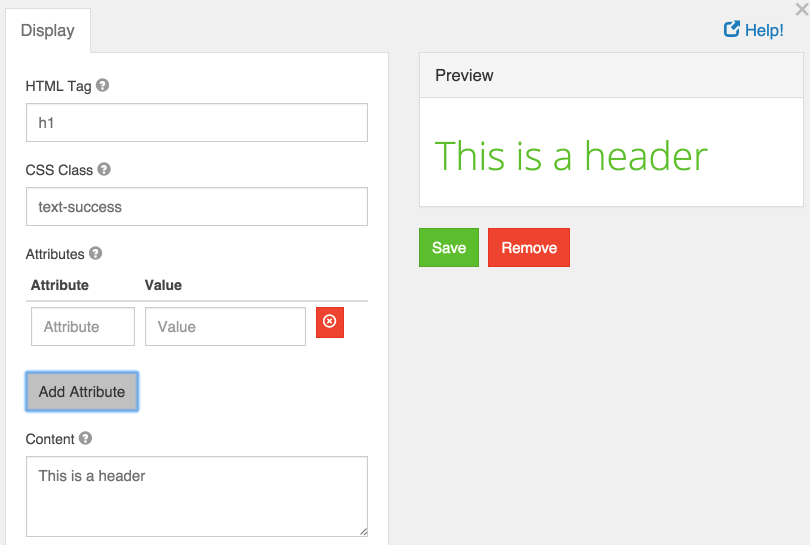
HTML Tag
The name of the HTML tag to display.
CSS Class
The CSS class to add to the HTML element. You may specify multiple classes by separating them with single spaces.
Attributes
Attributes and their values to add to the HTML element. This is commonly used to add href attributes to <a> tags, or src attributes to <img> tags.
Content
The text content of the HTML element. While adding more child HTML tags here will properly display them, it is recommended you use the Content component to easily write and preview more complex HTML.
Content
Content may be added to a form to provide non-field information. For example, if you need instructions at the top of a form that are for display only, use a Content component. There are no settings for a Content component and the value is not submitted back to the server.
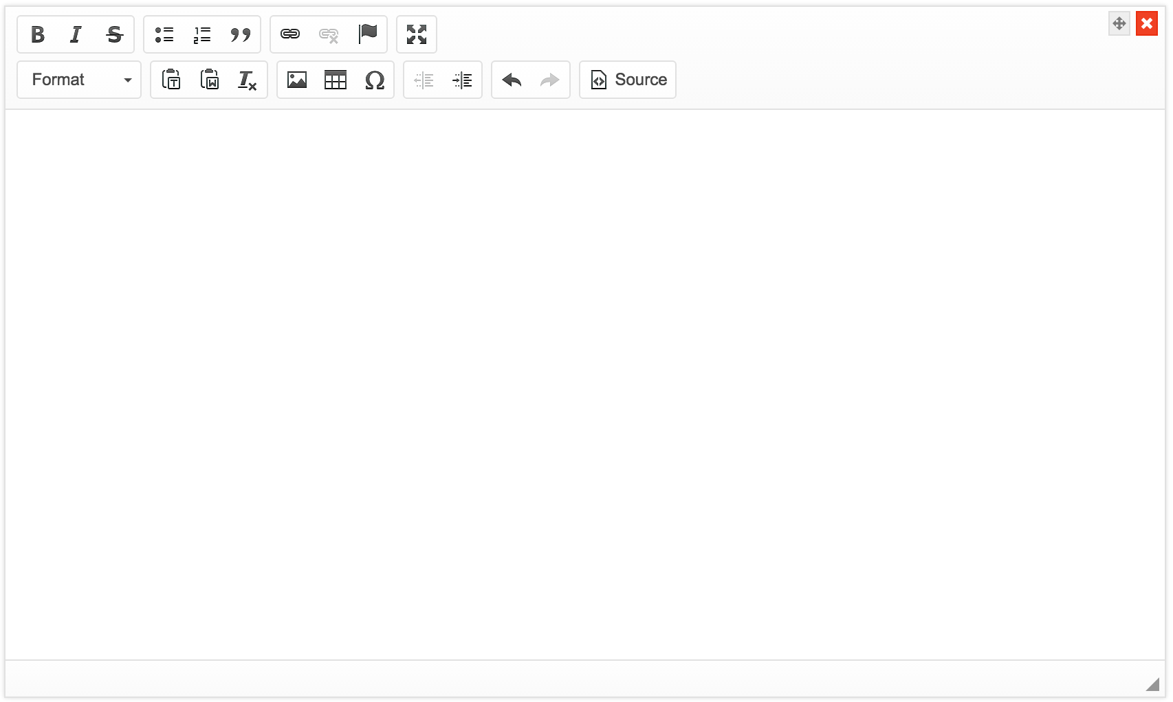
A WYSIWYG editor has been provided to help with formatting the content. If you use the HTML view of the editor, note that all unsafe HTML is stripped before rendering to prevent cross-site scripting exploits. This includes tags like <script>, <embed>, and <style>, and attributes like onmouseover or onload.
Button
Buttons can be added to perform various actions within the form.
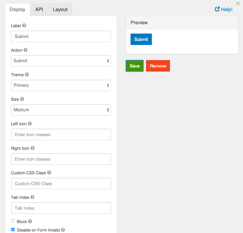
Label
This is the label or title that will appear on the button.
Action
This is the action that will be performed. Currently there are two actions that can be performed, submit and reset.
Submit
A submit action submits the form.
Reset
Reset the form fields back to their original state.
Theme
Set a theme (color) for the button. These options currently map to Bootstrap classes that will be added to the button.
Size
Set the size of the button. These options currently map to Bootstrap classes that will be added to the button.
Left Icon
If you have an icon library and would like to include an icon to the left of the button label, you can do so by adding the icon class here.
Right Icon
If you have an icon library and would like to include an icon to the right of the button label, you can do so by adding the icon class here.
Custom CSS Class
A custom CSS class to add to this component. You may add multiple class names separated by a space.
Tab Index
Sets the tabindex attribute of this component to override the tab order of the form. See the MDN documentation on tabindex for more information on how it works.
Block
If checked, the display of the button will be set to “block” which will cause it to span the full width of the container.
Disable on Form Invalid
If checked, this button will be disabled if any of the client side validation fails. This is useful for preventing the submission of a form that has invalid data entered.
The email component is nearly identical to the text field component. The Email component has a custom validation setting that, if set up correctly, can ensure the value entered is a valid email address. The email component can also more easily be integrate into a form’s email action. Use this component when you want an email address field for your form.
Realtime Email Validation using Kickbox.io
In addition to the normal email format validation, we are excited to bring real-time Email validation through our integration with Kickbox.io. For more information on how this works, please checkout the Kickbox Integration section.
Phone Number
The phone number form component can be used to enter phone numbers in a form.
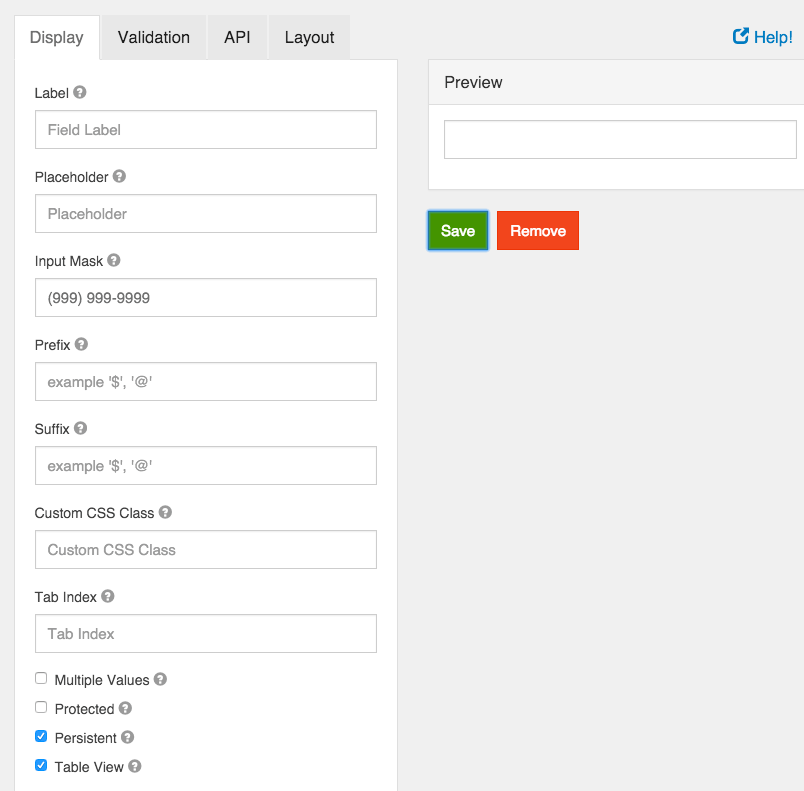
A textfield can be used for general text input that is shorter than a sentence. There are options to define input masks and validations so information can be molded into desired formats.
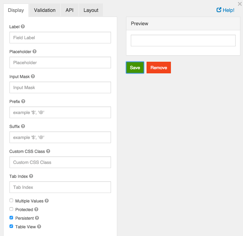
Label
The label for this field that will appear next to it.
Placeholder
The placeholder text that will appear when this field is empty.
Input Mask
An input mask helps the user with input by ensuring a predefined format. For a phone number field, the input mask defaults to (999) 999-9999.
- 9: numeric
- a: alphabetical
- *: alphanumeric
Example telephone mask: (999) 999-9999
See the jquery.inputmask documentation for more information.
Prefix
The text to show before a field. An example is ‘$’ for money
Suffix
The text to show after a field. An example would be ‘lbs’ for weight.
Custom CSS Class
A custom CSS class to add to this component. You may add multiple class names separated by a space.
Tab Index
Sets the tabindex attribute of this component to override the tab order of the form. See the MDN documentation on tabindex for more information on how it works.
Multiple Values
If checked, multiple values can be added in this field. The values will appear as an array in the API and an “Add Another” button will be visible on the field.
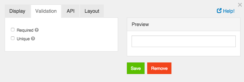
Unique
If checked, this field will be enforced as unique for this form. Submissions will be checked to see if an existing value matches. This validation is currently server side only.
Protected
If checked, this field is for input only. When being queried by the API it will not appear in the properties and also should not appear in exported data. You won’t be able to see the value on record list, but it will be stored in database under the hood.
Persistent
If checked, the field will be stored in the database. If you want a field to not save, uncheck this box. This is useful for fields like password validation that shouldn’t save.
Table View
If checked, this value will show up in the table view of the submissions list.
Required
If checked, the field will be required to have a value.
Address
The address form component is a special component that does lookups for addresses entered. It can be entered in free form and will save the address as well as geolocation and other information.
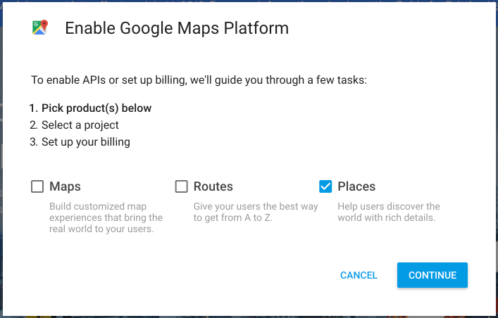
Google Maps API Key
Due to recent changes to the Google Geocode API usage policies, this is now required for all Address components. To setup an API key, you must follow the following directions.
- First, go to https://cloud.google.com/maps-platform/ and then click on the button that says Get Started
- Next, click on the button that says Places* and then press Continue
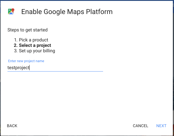
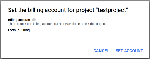
- On the next page, click the dropdown and select + Create new project (note, if you already have a project, then just select it) and then give your project a name, then click Next.
- Now that you have a project created, you can then setup Billing for that project by clicking on Set Account on the billing modal. If you selected an existing project, you will not see this page.
- If you created a new project, you will then need to provide a payment mechanism so that Google can charge for your usage of their GeoCode API.
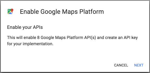
- On the next modal, you will then click Next to enable the Mapping API’s needed for the Address compoennt.
- The next modal will then show you the API Key that you need to use for this field in the Address component.
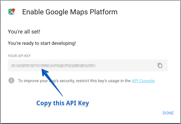
You will then paste this API key into the place on the Address component modal that says Google Maps API Key.
Label
The label for this field that will appear next to it.
Placeholder
The placeholder text that will appear when this field is empty.
Custom CSS Class
A custom CSS class to add to this component. You may add multiple class names separated by a space.
Tab Index
Sets the tabindex attribute of this component to override the tab order of the form. See the MDN documentation on tabindex for more information on how it works.
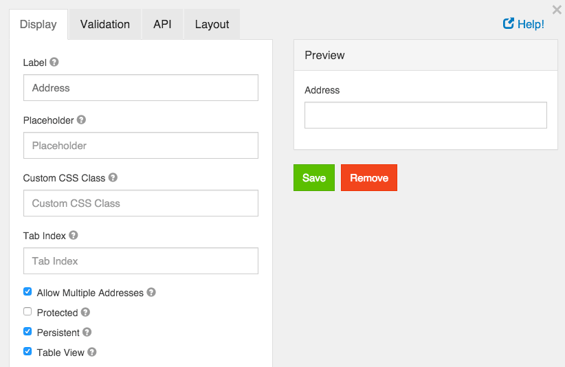
Allow Multiple Addresses
Allow multiple addresses to be entered into the field.
Unique
If checked, this field will be enforced as unique for this form. Submissions will be checked to see if an existing value matches. This validation is currently server side only.
Protected
If checked, this field is for input only. When being queried by the API it will not appear in the properties and also should not appear in exported data. You won’t be able to see the value on record list, but it will be stored in database under the hood.
Persistent
If checked, the field will be stored in the database. If you want a field to not save, uncheck this box. This is useful for fields like password validation that shouldn’t save.
Table View
If checked, this value will show up in the table view of the submissions list.
Required
If checked, the field will be required to have a value.
Date/Time
Date/Time form components can be used to input dates, times or both dates and times.
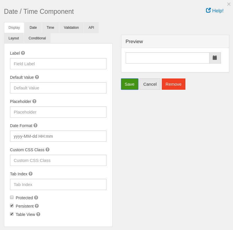
Label
The label for this field that will appear next to it.
Default value
The default value for the date component. You can put new Date(); for the current date or use a few of Moment.js functions to set the date to a specific date. For example: moment().add(50, 'days').calendar(); You can use the add or subtract function to go forward or backwards in dates.
Placeholder
The placeholder text that will appear when this field is empty.
Date Format
The format for displaying this field’s date. The format must be specified like the AngularJS date filter.
Custom CSS Class
A custom CSS class to add to this component. You may add multiple class names separated by a space.
Tab Index
Sets the tabindex attribute of this component to override the tab order of the form. See the MDN documentation on tabindex for more information on how it works.
Protected
If checked, this field is for input only. When being queried by the API it will not appear in the properties and also should not appear in exported data. You won’t be able to see the value on record list, but it will be stored in database under the hood.
Persistent
If checked, the field will be stored in the database. If you want a field to not save, uncheck this box. This is useful for fields like password validation that shouldn’t save.
Table View
If checked, this value will show up in the table view of the submissions list.
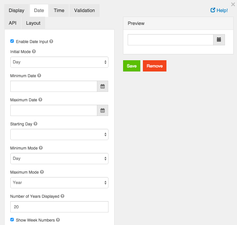
Enable Date Input
If this is checked, dates can be entered for this field.
Initial Mode
When the date picker appears, this sets the initial view of the picker.
Minimum Date
A value of the date that this field’s value must be after.
Maximum Date
A value of the date that this field’s value must be before.
Starting Day
On the calendar, select the day of the week that should start the week. In Europe this is typically Monday and in the US this is typically Sunday.
Minimum Mode
Limit the datepicker modes to a minimum of this value.
Maximum Mode
Limit the datepicker modes to a maximum of this value.
Maximum Years Displayed
The maximum number of years to display in the datepicker.
Show Week Numbers
If this is checked, when in Day mode, the datepicker will display the week number on the left hand side of the datepicker.
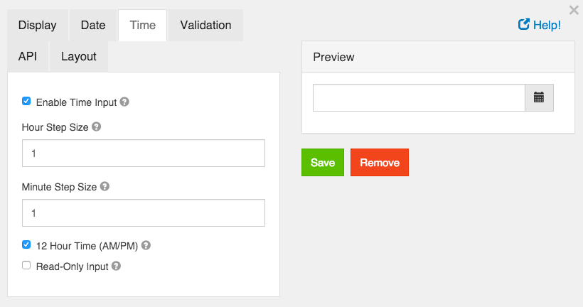
Enable Time Input
Allow entering a time as part of this field.
Hour Step Size
The number of hours to increment/decrement in the time picker.
Minute Step Size
The number of minutes to increment/decrement in the time picker.
12 Hour Time (AM/PM)
If checked, time will be displayed in 12 hour (am/pm) time. If not checked, it will appear in 24 hour time.
Read Only Input
If checked, users cannot directly enter a time. They can only use the increment/decrement controls to change the time. If unchecked, users can directly enter time values.
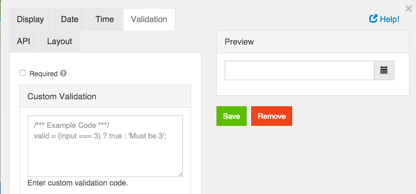
Required
If checked, the field will be required to have a value.
Custom Validation
You can use javascript to perform validation on a field. The way to respond is by setting the valid variable. If it is set to true then the validation passes. If you set it to a string, the validation fails and the validation message is set to whatever the valid variable is set to.
In addition, input variable is set to the value that has been entered in the field. The component variable is set to the definition of the field.
You can also reference other resources and properties for validation. For example, if there is a user resource with a password field, you can use its value with user.password
Currency
The Currency component should be used when a field should display currency amounts on a form. This component holds a numeric input mask that allows two decimal values and automatically adds commas as a user inputs a currency amount.
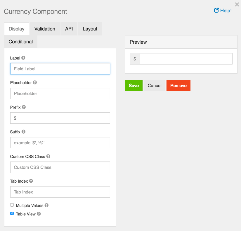
Label
The name or title for this component.
Placeholder
The placeholder text that will appear when this field is empty.
Prefix
The text to show before a field. An example is ‘$’ for money
Suffix
The text to show after a field. An example would be ‘lbs’ for weight.
Custom CSS Class
A custom CSS class to add to this component. You may add multiple class names separated by a space.
Tab Index
Sets the tabindex attribute of this component to override the tab order of the form. See the MDN documentation on tabindex for more information on how it works.
Multiple Values
If checked, multiple values can be added in this field. The values will appear as an array in the API and an “Add Another” button will be visible on the field allowing the creation of additional fields for this component.
Table View
If checked, this value will show up in the table view of the submissions list.
Resource
A resource field allows users to reference other resources in your project. For example, if you have a Director resource and a Movie resource, you can add a resource field on the Movie to reference the Director.
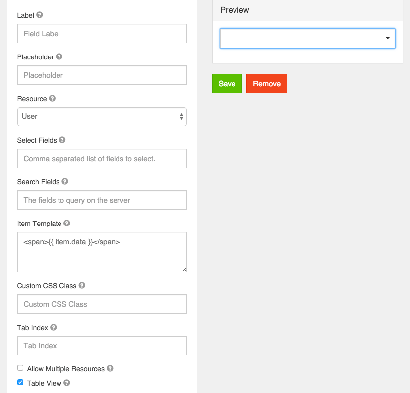
Label
The label for this field that will appear next to it.
Placeholder
The placeholder text that will appear when this field is empty.
Resource
Select the type of resource to reference. This must be an existing resource within your project.
Search Expression
A regular expression to filter the results with. If you don’t want to show all possible resources within the Resource type selected in Resource you can limit which ones will appear in the options by enter a Regular Expression.
Select Fields
Select which properties on the resource to return as part of the options. Select whichever fields you want to display in the template.
Search Fields
A list of search filters based on the fields of the resource. See the Resource.js documentation for the format of these filters.
Item Template
How an item should appear in the list. Use {% raw %}{{}}{% endraw %} brackets to reference variables to display. Be sure to use “Select Fields” above to select the fields to display.
Custom CSS Class
A custom CSS class to add to this component. You may add multiple class names separated by a space.
Tab Index
Sets the tabindex attribute of this component to override the tab order of the form. See the MDN documentation on tabindex for more information on how it works.
Allow Multiple Resources
If checked, more than one value will be allowed to be entered.
Table View
If checked, this value will show up in the table view of the submissions list.
Signature
A signature field is a special field that allows someone to sign the field with either their finger on a touch enabled device or with the mouse pointer. This signature will be converted into an image and stored with the form submission.
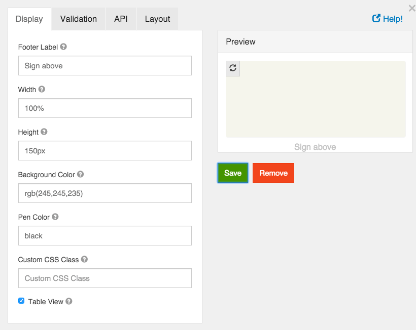
Footer Label
You can enter a short instruction here.
Width
How wide the signature area should be. This can be in pixels or percents.
Height
How high the signature area should be. This can be in pixels or percents.
Background Color
The Background color of the signature area. This can be an RGB value in RGB(255,255,255) format, a hex value like #000000 or the name of a color.
Pen Color
The pen color in the signature area. This can be an RGB value in RGB(255,255,255) format, a hex value like #000000 or the name of a color.
Custom CSS Class
A custom CSS class to add to this component. You may add multiple class names separated by a space.
Table View
If checked, this value will show up in the table view of the submissions list.
Survey
The Survey component works similar to the radio. Instead of one question, users are able to select a value for multiple questions which are configured within the component settings. Survey is a great component to utilize when asking multiple questions with the same context of answers or values.
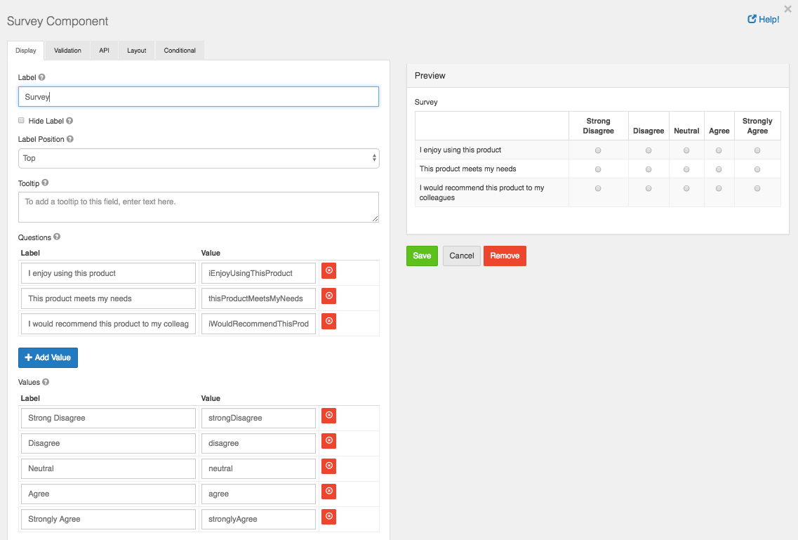
Label
The label for this component that will appear next to it.
Questions
The questions you would like to ask within the survey.
Values
The values that can be selected per question. Example: ‘Satisfied’, ‘Very Satisfied’, etc.
Custom CSS Class
A custom CSS class to add to this component. You may add multiple class names separated by a space.
Tab Index
Sets the tabindex attribute of this component to override the tab order of the form. See the MDN documentation on tabindex for more information on how it works.
Protected
If checked, this field is for input only. When being queried by the API it will not appear in the properties and also should not appear in exported data. You won’t be able to see the value on record list, but it will be stored in database under the hood.
Persistent
If checked, the field will be stored in the database. If you want a field to not save, uncheck this box. This is useful for fields like password validation that shouldn’t save.
Table View
If checked, this value will show up in the table view of the submissions list.
Required
If checked, the field will be required to have every question answered. If it is required, you may not need to persist the value as it can be assumed to be checked when a form was submitted or it will not submit.
Custom Validation
You can use javascript to perform validation on a field. The way to respond is by setting the valid variable. If it is set to true then the validation passes. If you set it to a string, the validation fails and the validation message is set to whatever the valid variable is set to. In addition, input variable is set to the value that has been entered in the field. The component variable is set to the definition of the field.
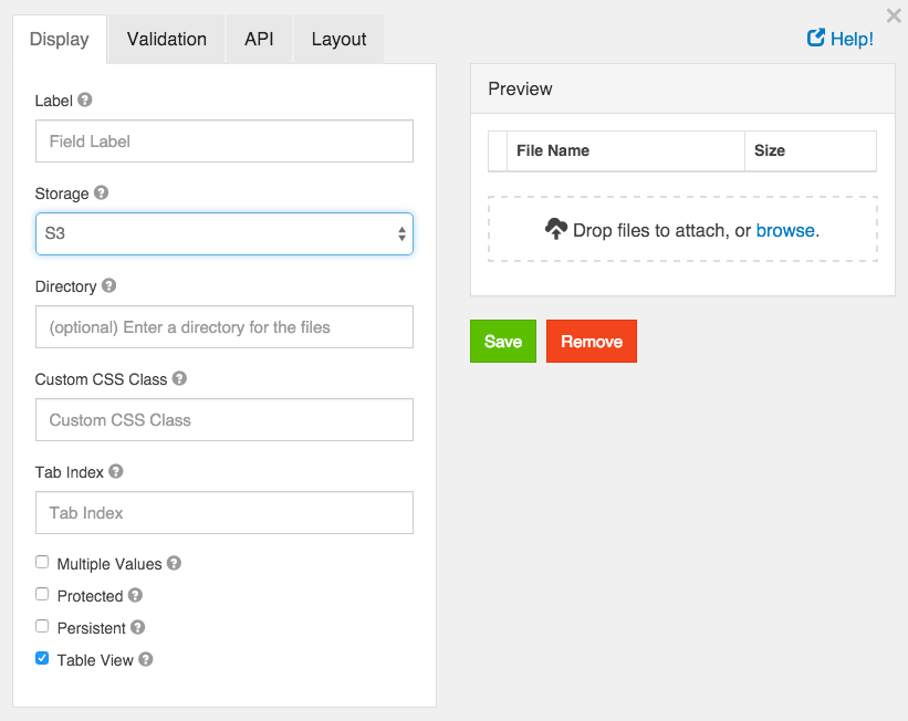
File
A file field allows users to upload and download files to a form. In order to use a file field, file storage must be set up. Choose Omnibasis from Storage dropdown.
Label
The label for this field that will appear next to it.
Storage
This is the storage provider where the file will be stored and accessed from. Select the appropriate provider. All providers besides Url require additional configuration in project settings.
Upload Url
If Url is selected in Storage, enter the Url of the service. It must be compatible with the ng-file-upload service and return an object that includes the url to access the file.
Directory
This field will append all files with the string so that they are in a directory on the storage provider. Must end in “/”.
Custom CSS Class
A custom CSS class to add to this component. You may add multiple class names separated by a space.
Tab Index
Sets the tabindex attribute of this component to override the tab order of the form. See the MDN documentation on tabindex for more information on how it works.
Multiple Values
If unchecked, only one file per field is allowed. If checked, multiple are allowed.
Protected
If checked, this field is for input only. When being queried by the API it will not appear in the properties and also should not appear in exported data. You won’t be able to see the value on record list but it will be stored in database under the hood.
Persistent
If checked, the field will be stored in the database. If you want a field to not save, uncheck this box. This is useful for fields like password validation that shouldn’t save.
Table View
If checked, this value will show up in the table view of the submissions list.
Webcam Feature
We have additional File component settings that are currently on our Beta site. This includes a Webcam feature which allows the user to utilize the webcam on their local machine to take a picture and upload to the component.
When using the form, you will see a ‘Camera’ button on the component. Clicking the camera button will activate your webcam enabled on your local machine with the ability to take and upload photos.
Nested Form
Nested Form component allows you to insert one (child) Resource/Form with all its fields into another (parent) Resource/Form.
For example, if you have Song resource (parent) and Artist resource (child) and you want to create both Song and Artist submissions by submitting one form, you may use Nested Form component for this case.
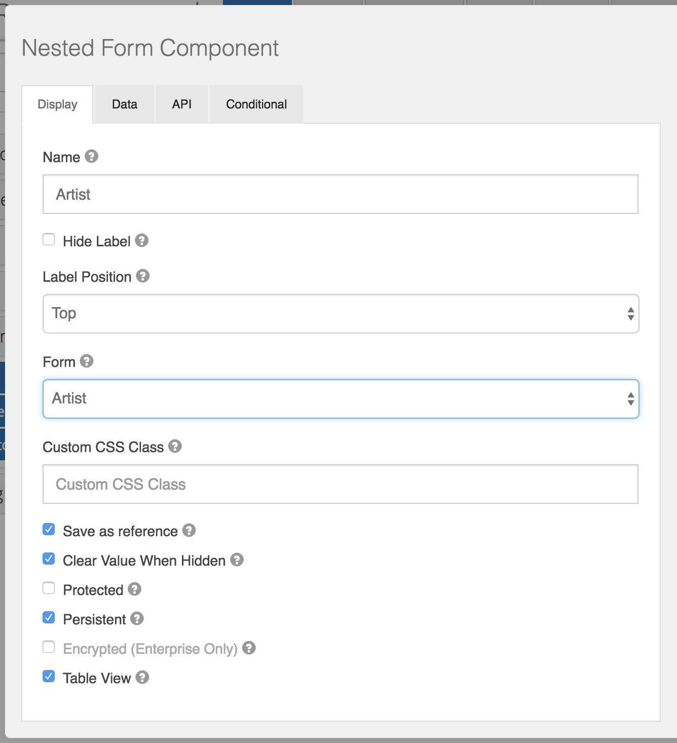
Name
The label for this field that will appear next to it.
Hide Label
Check if you want to hide the label when your parent form is rendered
Label Position
Choose where to render the label relatively to the Nested Form component itself
Form
Select a child Form/Resource that you’d like to nest into parent form
Custom CSS Class
CSS class / classes (space separated) that will be added to component’s element
Save as reference
Check if you’d like to save only _id of child form submission instead of storing all child submission object inside of parent submission. This will also help all changes you’ve made in child submission be reflected in parent submission. If not checked, whole child submission object will be saved, and no any child submission changes would be reflected in parent submission.
Component Data
The Component ‘Data’ settings will allow you to configure the way your data is saved, rendered, or calculated on your field.
Default Value
Default value will be the value for this field, before user interaction. Having a default value will override the placeholder text.
Input Format
Input Format setting protects from cross-site scripting attacks. Input types default to ‘Plain’, but ‘HTML’ as well as ‘Raw’ can be selected.
Database Index
Set this field as an index within the database which can increase performance for submission queries. Note - this setting is only available on the Enterprise plan and must have a Submission Collection set in order to activate.
Custom Default Value
Write JavaScript or JSON to customize the value the field will be defaulted to.
Calculated Values
Caclulated values allow calculating values based on the values in other fields of the form. Calculated values uses plain javascript and can return any value to the field. There are two variables available to calculate off of, data and row. data is the full data in the form. You can access values within it by using the field keys. For example data.myfieldkey. If you field is within a datagrid, there is an additional variable available of row which contains the values for that row of the datagrid. You can access the values the same as with data as row.myfieldkey. The values are also in data.mydatagrid[0].myfieldkey and data.mydatagrid[1].myfieldkey plus each additional row as the index.
Also you have access to special util variable - library of useful functions. More information about util library could be find here.
Return the calculated value in the value variable and it will be set. Each time the form values change it will be recalculated. You do NOT need to watch form fields as you do for other custom logic in your form. It will automatically update.
It is very common to disable the field using calculated values.
reCAPTCHA
reCAPTCHA component implements reCAPTCHA v3.
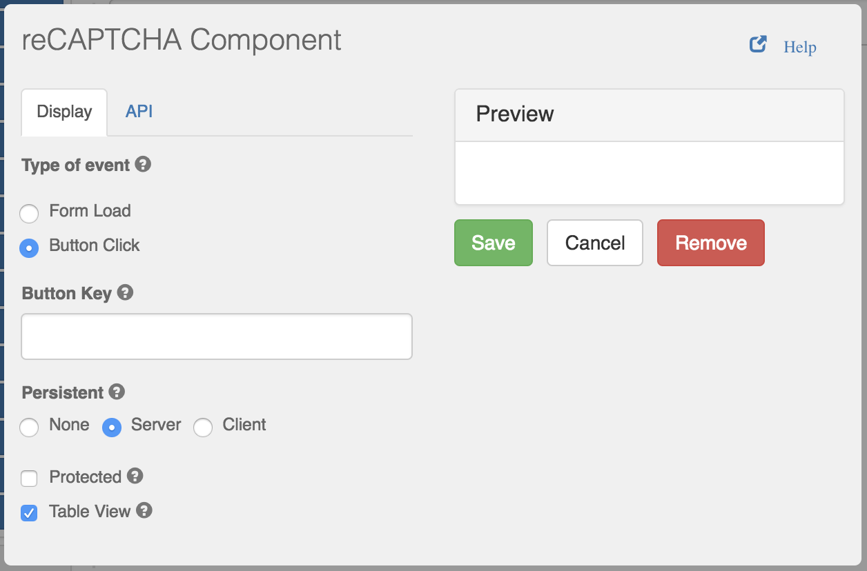
Type of event
Event to which this reCAPTCHA component would react
Button Key
API Key of the button for reCAPTCHA component to react to (only for Button Click type of event)
Component API
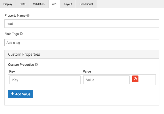
Property Name
Form components directly translate to a resource property on the API that is generated for the form. By default a property name is generated by camel casing the field title. You can change the property name by going to the API tab in the form component settings.
Field Tags
Tag the field for use in custom logic or within your application.
Custom Properties
This allows you to configure any custom properties for this component by setting a ‘Key’ and ‘Value’ the property.
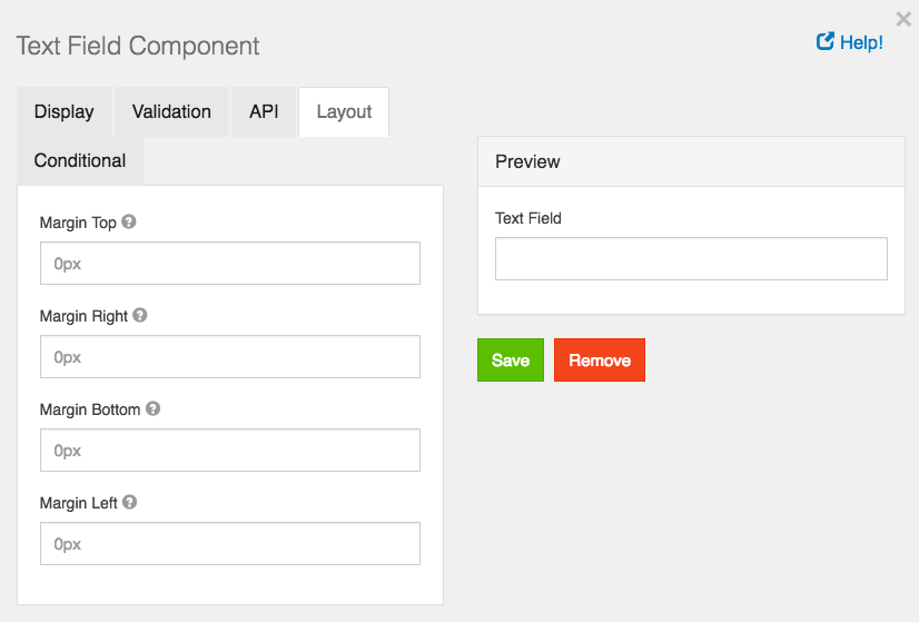
Component Layout Settings
In addition to Layout Components, which are detailed in the next section of this guide, you can marginally change the arrangement of the components on your Form within the Layout settings. Each component allows for marginal layout changes from top, bottom, left, and right.
To change the layout, simply input a margin amount in the Top, Right, Bottom, or Left field. Components will be arranged accordingly depending on what margin field you input to. Set margins must be a valid CSS measurement input like “10px” in order to render properly.
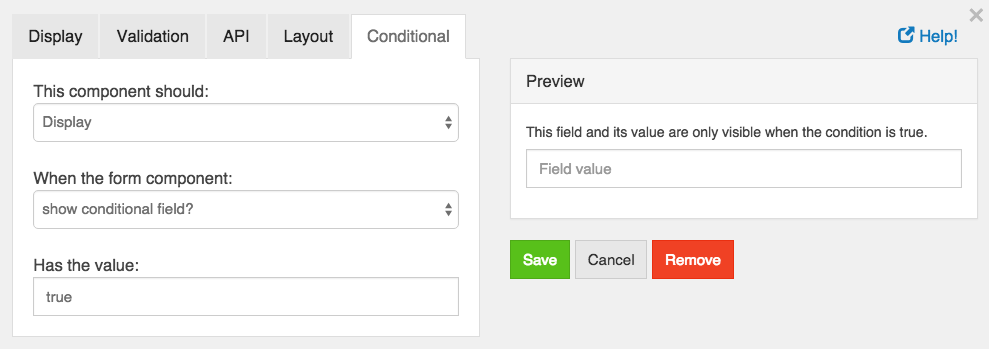
Conditional Components
Any form component can use conditional logic to determine when to hide or display itself. The settings for a conditional field, are configured on the component itself, and can be found by viewing the Conditional tab within the components settings.
The conditional logic is based on the following rules:
- Each field can hide or display.
- The visibility is dependent on another component defined within the form.
- The logic is activated when the configured field contains the plaintext value defined in the settings.
In addition to Simple Conditional logic, you can also use Advanced Conditional logic, which uses actual JavaScript for any combination of conditions.
JavaScript conditional logic requires you to set the value of show to either true or false. You have access to the current value of any form component via the data object, and the components API key. Advanced Conditional logic will only work, if Simple Conditional logic isn’t already defined.
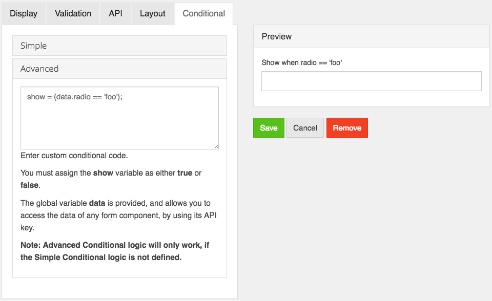
When using Advanced Conditional logic with the select boxes form component, you must use the following syntax to get the value of the select box, which will always be true or false, depending on if it is checked or not: data.selectbox_component.selectbox_value
Calculated Value
Caclulated values allow calculating values based on the values in other fields of the form. Calculated values uses plain javascript and can return any value to the field. There are two variables available to calculate off of, data and row. data is the full data in the form. You can access values within it by using the field keys. For example data.myfieldkey. If you field is within a datagrid, there is an additional variable available of row which contains the values for that row of the datagrid. You can access the values the same as with data as row.myfieldkey. The values are also in data.mydatagrid[0].myfieldkey and data.mydatagrid[1].myfieldkey plus each additional row as the index.
Also you have access to special util variable - library of useful functions. More information about util library could be find here.
Return the calculated value in the value variable and it will be set. Each time the form values change it will be recalculated. You do NOT need to watch form fields as you do for other custom logic in your form. It will automatically update.
It is very common to disable the field using calculated values.